Dash Web app's key visualizations
Machine Learning
Developed an app that provides interactive visualizations for text classification using the Naive Bayes Classifier. This algorithm belongs to the AI subfield called Machine Learning, where systems learn and make predictions from given data.
The goal was to demystify the algorithm's inner workings, helping users understand how it categorizes text documents. Furthermore, it serves as a tool for identifying and addressing performance issues, as it can be challenging to pinpoint the causes of incorrect classifications. The intent was to offer transparency in the decision-making process, ultimately improving user comprehension.
The app is available at the bottom of the page. It offers numerous options and features, with some of them may already require a basic understanding of Machine Learning. To ensure clarity for all users, we will focus solely on the key elements that can be understood by everyone. These key elements are described below.
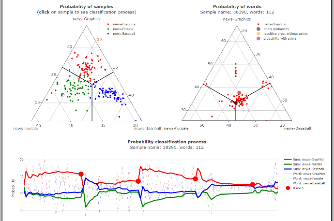
Ternary Graphs
In the first ternary (triangle) graph, we can see samples represented by color, indicating their respective categories. The position of vertices in the triangle represent the model's predictive confidence. The closer a point is to a vertex, the more confident the model is in its prediction. Conversely, as a point approaches the boundaries with other categories, the model becomes less certain.
Similarly, just as we visualize all classified samples, we can also visualize all the words within a single sample.
When we click on a sample in the left graph, a corresponding graph on the right side appears. This graph provides insights into how each word contributed to the result in the selected sample, much like the left graph does through its position.
Process Graph
This graph provides a comprehensive view of the entire classification process as we iterate through all the words in the selected sample. The solid line signifies a cumulative probability within a specific segment of words separated by the bold dots. The colors indicate a category which the corresponding word segment would be classified into.
At each of these points, these cumulative probabilities reset to zero, enabling us to visualize the calculation progress throughout the entire sample. You can adjust the length of these segments using the slider located above the graph. This feature allows us to gain insights into which categories specific sections of the text document are more closely associated with.
Bar Chart
This section displays the uniqueness of words within each category. The higher a word's value, the less likely it is to appear in other categories. The goal is to identify which words are characteristic of a specific category. Additionally, the graphs display values in parentheses, indicating the count of occurences of words within the sample.